Performance - As a group we decided that, whilst we needed a performance element, we didn’t want a normal one. In attempt to find a middle ground we made the piano look like it was playing itself. This allowed us to follow the classic music video convention of a performance element, but twist it in a way where it wasn’t derivative.
Colour/Lighting – We wanted to set the tone of our video as ethereal and yet slightly moody, so the lighting was neutral if not sometimes cold. The colours in the video were muted and reflected the melancholic feel of the song.
Costume – The costume in our video reflected the style of the song and the audience it is intended for. Our artist is dressed in skinny jeans, smart shoes and a shirt or coat depending on the setting. He was styled with pieces which indicate ‘indie’ culture, which would more likely appeal to this young, cultured, fashionable audience the song is intended for.
Set – The set needed to establish the type of artist we were using and the music genre he represents. The video was split between an old, abandoned house and a white studio. Both locations were sparse, with very few props involved, emphasising his loneliness and troubled nature which supports his star image.
Camera – Throughout our video we used a lot of MCUs, allowing action to be seen whilst staying close enough to our artist to permit his emotions and facial expressions to show.
Editing – In order to mirror the pace and rhythm of the song we used relatively long, still shots throughout the majority of the video. However this was not the case during the ballerina’s dance sequence, where in order to make a more dynamic sequence, the cuts became much faster. Whilst this may not have been conventional, the group found this faster cutting to work in this case.
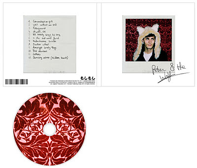
The CD cover we designed for our artist remained cohesive with his star image and the style of the video, using repeated motifs of the wallpaper, polaroid and handwriting which all appeared in the film. The cover also managed to remain in keeing with the style of the alternative/indie genre we were trying to go for, with a specific colour scheme and the currently popular polaroid/vintage look it has. Below are examples of real world covers.


No comments:
Post a Comment